What’s in a font? Quite a lot, it turns out…
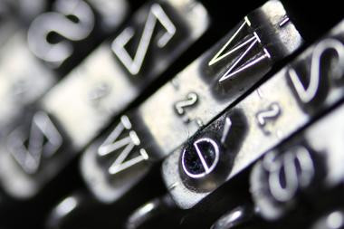
The choice of font may not seem like the most important choice when writing a business document, but get it wrong and your message could be lost in a sea of illegibility and confusion
Jermaine HaughtonManagement memos and messages are vital for getting across messages to teams and the wider company. But when this is printed or posted online, the wrong font choice can be catastrophic and destroy the meaning and intent of the publication.
Whether by letter, memo or email, written communications sent from bosses to employees and clients are a vital tool for drawing attention to a particular issue. But they are trickier to devise than it would initially seem.
With the ever-growing demands of the workplace and the thousands of emails and documents workers are required to read each year, business managers and executives are typically short on time.
Therefore, senders must not just focus on creating a well-written message but put significant thought into the nature of the font and the layout, in order to maintain the reader’s interest, emphasising the importance of the issues addressed and represent the professionalism of the organisation.
With the attention of workers likely divided during the time of reading the email or memo, graphic designers argue the typeface, design layout, and legibility become an even more vital component within corporate written communications, as readers are likely to be incredibly quick and critical in judging how urgent the issues identified in messages are to them, and influence how well they react to the statement.
Erik Kangas, computer programmer and founder of software-as-a-service company LuxSci, said this can be explained by the way people tend to take in information they read on paper or online.
“When we read, our eyes follow a pattern called a scan path,” he said. “A scan path is like a journey for your eyes made up of saccades (jumps) and fixations (pauses). As you read, your eyes bounce along each line in small jumps. With each jump, everything is semi-unclear and ends in a small pause.
“This pause allows your brain to take a snapshot of the letters. In a matter of seconds your brain arranges the letters into words, words into sentences, and then formulates meaning. So, why does this matter when choosing a font? You only have a few minutes to make an impact with each email you send, so you must make each word count.”
When testing whether typography can affect mood and cognitive performance, Dr. Kevin Larson of Microsoft and Dr. Rosalind Picard of the Massachusetts Institute of Technology found that when the passage was typographically well formatted, people were so engrossed in the subject, that they underestimated the time they spent reading it.
HOW TO FIND YOUR IDEAL FONT
Although some typographers will argue strongly for either sans serif or serif to be the ideal font style for business communications, there is no conclusive evidence to show either one trumps the other.
However, both font categories have slight differences and managers must decide which one best suits the brand and voice of the company. Those with small projecting features are known as serifs.
Examples include Times New Roman, Garamond and Bookman Old Style.
Times New Roman, in particular, is the generally accepted font for business letters because of its readability, and suits documents such as guidelines, laws and codes of conduct for its conservative style.
Fonts that lack these small projecting features are called sans serif (from the French for ‘without’, but usually pronounced ‘sanns’ by printers). Arial, Helvetica and Verdana are the most common.
Unlike Times New Roman, Arial has straight lines and smooth curves, and despite having a traditional appearance isn't too mechanical or industrial, making it a suitable font for business letters and other forms of professional correspondence.
According to type designer Jessica Hische, it is important to first select the font that will be most prevalent to the organisation’s project, memo, email or document type. This will most likely be the font of the body content, from which the writer can base all other fonts, like your headings and subheadings around.
Hische advises against decorative font as your body typeface because they typically have low legibility, and slow down and frustrate the reader.
Font size is also an important consideration for managers.
In the UK, a font size of at least 12 point is standard, with a 14 point sometimes used to target older readers or those with greater difficulty reading. Choosing a font size of less than 12 point for messages is ill-advised due to potential difficulties of reading the material without the assistance of magnification.
On the other hand, a large font tends to look overstated, juvenile and unprofessional. To find out whether font size matters, Michael Bernard of Usability News (produced by the Software Usability Research Laboratory at Wichita State University) found that Verdana, Arial, and Comic Sans were the most preferred fonts at 10, 12, and 14 point sizes, after comparing the eight most popular fonts.
In addition to font sizing, the spacing of the text must be evenly-matched allowing for a relaxed and engaging read. Well-aligned text, with line-spacing of 1.5 or 2 makes messages seem easier to digest for readers. "When we read, we don't read letter by letter," Jose Scaglione, who designed Literata, the custom font for Google Play books, said. "We recognise a group of letters and recognise the interaction that exists between the black and the white."
Ultimately, bosses must be mindful of the purpose of their business correspondence, whether internal or external. Memos and business letters are generally not a showcase of your artistic ability but to convey a concise and strong message.
Therefore, managers should avoid fonts with embellishments, unique curvatures and unusual designs to ensure that a business letter is easy to read and conveys professionalism.


Press & Media Enquiries
For more information or to request interviews, contact CMI's Press Team on 020 7421 2705 or email press.office@managers.org.uk